

Typography carries a quiet power. A font can steady a reader’s attention, or it can make the eyes flee. It shapes tone, mood, and the way meaning seeps into the mind. Yet, despite decades of design research, some fonts continue to bewilder even seasoned typographers. They sit in the hall of the worst fonts, not merely because people dislike them, but because they consistently disrupt readability, aesthetic flow, or the subtle relationship between text and intention.
I have often wondered why certain typefaces, even those celebrated for a brief moment, eventually slide into the category of worst fonts ever. Perhaps it is our evolving design sensibility. Or perhaps, as some designers have suggested, these fonts simply never worked. They were destined to fall. One wrong curve, one disproportionate counter, one clumsy stroke, and everything collapses. This is not simply a list. It is closer to a story about misjudgment, excess, overuse, or plain structural flaws. A story that countless designers might recall with a sigh. Applications like Canva or Adobe Fonts quietly distance themselves from many of these typefaces, and the design communities on places like Smashing Magazine have repeatedly highlighted why nobody wants this font or that one. The conversation never ends.To explore more design insights and resources, visit us.
What Actually Makes a Font Bad? A Brief Reflection
Typography experts often suggest that a font becomes “bad” when several structural and contextual factors converge, disrupting the delicate balance between clarity and personality. Several factors, grounded in professional typographic standards, influence whether a font earns a place among the worst fonts.
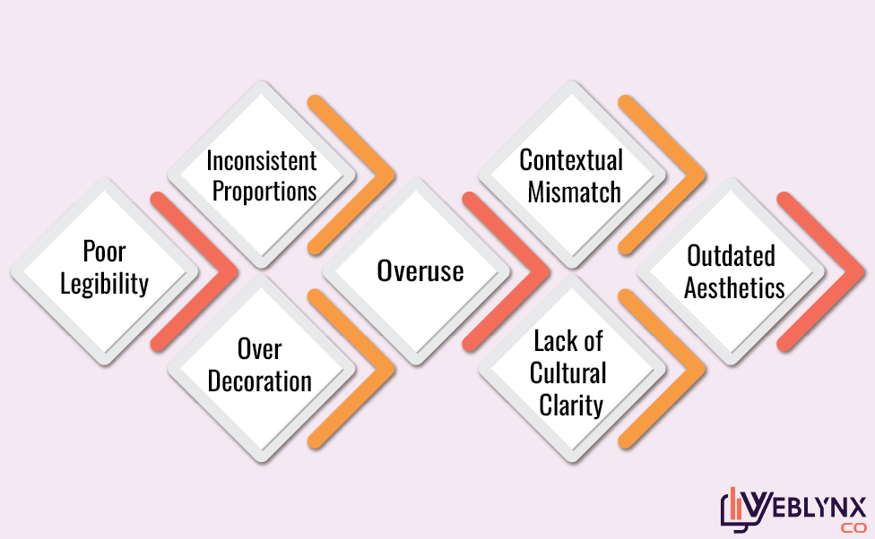
Poor legibility
Typography scholars frequently argue that readability is the essential criterion. Fonts that distort letterforms, collapse counters, or disrupt spacing impede comprehension.
Inconsistent proportions
Some fonts lack coherent stroke weight or geometric harmony. When the eye must adjust constantly, fatigue increases.
Contextual mismatch
A casual font in a legal document. A dramatic font in a financial report. Typography demands contextual sensitivity.
Over-decoration
When embellishment overwhelms function, the message becomes secondary.
Overuse
Even a well-designed font may slide into the category of the worst fonts if used excessively, losing its distinctiveness.
Lack of cultural clarity
Fonts like Papyrus raise debates about authenticity, cultural borrowing, and vague referentiality.
Outdated aesthetics
Trends evolve. A once-celebrated script may feel stale decades later.
Typography, at its core, is the art of balancing clarity with personality. These fonts falter because that balance fractures.
So here they are, examined with care, hesitation, and the occasional raised eyebrow. The 15 worst fonts and why typography experts often advise keeping them far away from anything that needs to communicate well.
1.Comic Sans
Everyone knows this one. Designers flinch. Students misuse it. And professionals avoid it with an almost ceremonial seriousness. Comic Sans might have been charming in the 90s, but now it appears unserious in contexts demanding formality. The letters wobble slightly. The proportions seem inconsistent. Many consider it the worst font ever for business communication. It might work for a kindergarten poster. Might. But its exaggerated playfulness makes it appear childish in nearly every other scenario.
2. Papyrus
Few fonts sparked as much debate as Papyrus. It attempts an aged, textured look, yet the texture appears artificial. When James Cameron used it for the Avatar title, typographers reacted with visible disbelief. Many argued that its cultural vagueness feels careless. Too Egyptian? Too fantasy? Too ambiguous to pinpoint. It lands awkwardly between worlds. Which is why many designers label it among the most hated fonts.
3. Curlz MT
Whimsical. Decorative. Overly decorative, some would say. The curls interrupt smooth reading. The letters appear to dance, yet not gracefully. Children might enjoy it for a moment, but professionals approach it cautiously. The typography community frequently categorizes Curlz MT as one of the ugliest fonts because its embellishments overshadow legibility. A font should support content. Curlz MT competes with it.
4. Jokerman
A chaotic spectacle. When a font tries too hard to be interesting, it often becomes unreadable. Jokerman’s decorative dots and broken strokes scatter the eye. One could call it expressive, although arguably it expresses confusion more than anything else. It is often listed among the terrible fonts that challenge comprehension. Readers pause not because the message is deep, but because they are trying to decipher the letters.
5. Bradley Hand
At first glance, Bradley Hand seems harmless. A handwriting font that aims for casual familiarity. Yet it suffers from what many refer to as artificial handwriting ambiguity. It feels too uniform to be real handwriting and too irregular to be professional. It sits in a strange middle space. Some argue that this uncanny quality is what places it among the worst fonts for professional branding.
6. Chiller
The name suggests something edgy. Horror-like. And the shapes deliver that intention, though in a forced manner. The jagged lines overpower the words. The letters appear unstable, almost melting. While Chiller may succeed in specific art projects, its readability collapses in longer texts. The font is often criticized in design forums like Typewolf . Many users describe it as visually aggressive and one of the most unreasonable fonts for general use.
7. Impact
This one might surprise people. Impact is bold, heavy, and widely recognized. Yet typographic experts often argue that its density suffocates white space. The counters shrink. The strokes dominate. It becomes tiring for the eyes. It works for memes precisely because brevity hides its flaws. Longer paragraphs? Impossible. Some might disagree, but many classify it as an annoying font in extended use.
8. Times New Roman
A classic, yes, but classics sometimes age awkwardly. Times New Roman was created for narrow newspaper columns, not modern digital screens. It compresses too tightly. Its sharp serifs and constricted x-height can strain the eyes on small displays. While not inherently a terrible font, it is arguably one of the most boring fonts through sheer overuse. Familiarity does not equal excellence.
9. Arial
Another controversial entry. Arial has long been a default font. Perhaps that is its main flaw. Designers often critique it for lacking distinctive personality. It copies many characteristics of Helvetica, but without its refined symmetry. For this reason, some typographers identify Arial as an overused font that feels bland and mechanical.
10. Brush Script
Flowing, nostalgic, and unfortunately hard to read. The letters connect in ways that make rapid reading slow. Some designers view Brush Script as a relic of the mid-20th century diner aesthetic, stuck in time. Many brand strategists argue that it might be the worst font for modern web design due to its dated strokes.
11. Vivaldi
Elegant at a glance. Excessive upon closer study. The flourishes, loops, and exaggerated slants may appeal to those seeking drama. Yet these elements also obscure clarity. Even printed invitations suffer when the script becomes too ornamental. It often appears in discussions about horrible fonts that miscommunicate intent.
12. Hobo
Rounded edges. Missing straight lines. A peculiar 1960s aura. Hobo feels experimental, though perhaps unintentionally so. Its refusal to use straight edges can confuse the eye. Typography experts frequently classify it as one of the worst fonts ever because its visual identity is difficult to contextualize. Too playful for formal contexts, yet oddly formal for playful ones.
13. Algerian
Bold, decorative, and heavily stylized. Algerian looks like it belongs on a vintage saloon sign. And perhaps it should stay there. The font’s elaborate outlines limit its flexibility. Digital readability drops instantly. It is often cited among the ugliest fonts in branding design because it overwhelms the message.
14. Lobster
At first, Lobster seemed fresh. A handwritten script with a modern twist. Then it appeared everywhere. Logos. Titles. Websites. Posters. The overuse became noticeable, especially on platforms like Behance. Some designers argue that its saturation contributes to its presence among the worst fonts for contemporary branding because it no longer feels original.
15. Trajan Pro
A surprising entry for some. Trajan Pro served well for movie posters, especially those seeking a dramatic, ancient atmosphere. But repetition bred fatigue. Its narrow cultural references make it unsuitable for general communication. Many discuss it as one of the most hated fonts in film titling simply because it has been used too extensively.
Conclusion
The world of type is vast. Some fonts rise. Some quietly fade. Others become infamous, lingering in discussions about the worst fonts long after their popularity ends. Whether due to poor readability, misguided ornamentation, or relentless overuse, these fifteen typefaces have carved out a place in the ongoing debate over what the worst font ever might be. Yet the conversation stays open. Preferences shift. Contexts change. And one designer’s terrible typography could be another’s nostalgic treasure. What seems clear is that fonts shape not only aesthetics but trust, mood, and meaning. It is worth choosing wisely, examining each typeface not just for beauty but for clarity, intention, and respect for the reader’s eye. Because once a font slips into the realm of the worst fonts, climbing back becomes unusually difficult. If you’d like to discuss typography or work with our team, feel free to reach out.
Frequently Asked Questions
1. What is the worst font ever?
Many argue that Comic Sans holds this position, although others claim Papyrus or Jokerman deserve the title. It depends on context and evaluation criteria.
2. Why do designers hate certain fonts?
Usually because of readability issues, stylistic excess, outdated design trends, or extreme overuse.
3. What makes a font hard to read?
Irregular spacing, disproportionate strokes, obstructive decorative elements, or compressed counters can contribute to poor legibility.
4. Are overused fonts considered bad?
Often yes. A font may be technically sound but lose impact due to saturation.
5. Can the worst fonts still be used effectively?
Possibly. With careful placement and intentional design choices, even disliked fonts may serve niche purposes.
